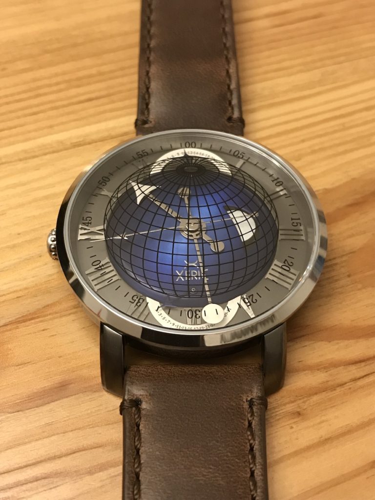
Xeric Atlasphere GMT
*Notice: This post represents my new format for watch review posts. Going forward, watch review posts will contain plenty of pictures and primary points, but less writing about the specific details. The details (more complete thoughts) are captured in the YouTube videos.*
Xeric has been around for a while, but Kickstarter still seems to be their goto for funding. That fact does beg the question about their financial model and longterm plans. I would think at this point that if their previous models had been truly successful that they would not be as reliant upon backer funding.
Most of Xeric’s designs are outside the norm, which is both good and bad. The designs are out there and do make a statement in terms of design, but are not the most practical watches, especially when it comes to readability.
I have not been particularly attracted to previous Xeric watches, but I love me a earth or space theme and the Atlasphere falls in that category, so I thought I would give it a try. Benefits to the GMT model are the retrogrades at the North (GMT) and South (date) poles. Given the complications, I am ok with it being quartz.
The review video: [https://youtu.be/wYPCptChKds]
The details:
- Model: Xeric Atlasphere GMT
- Diameter: 47mm (advertised as 46mm)
- Height: 11mm
- Weight: 85g (on leather)
- Lug-to-lug: 55mm
- Case: Stainless steel, Gunmetal
- Movement: Japanese Miyota GP52
- Lume: Unknown (low grade)
- Accuracy: +-20 seconds/month
- Crystal: Sapphire, Flat
- Water Resistance: 50m/150ft
- Strap: 22mm
- Price: $299 retail (backed on Kickstarter for $199)
The review:
Like many Xeric watches, the Atlasphere is about the design and overall look, being different, and making a sort of statement. But that clashes with practicality, readability, and usability.
Pros:
- Strap: Horween Leather and a nice buckle
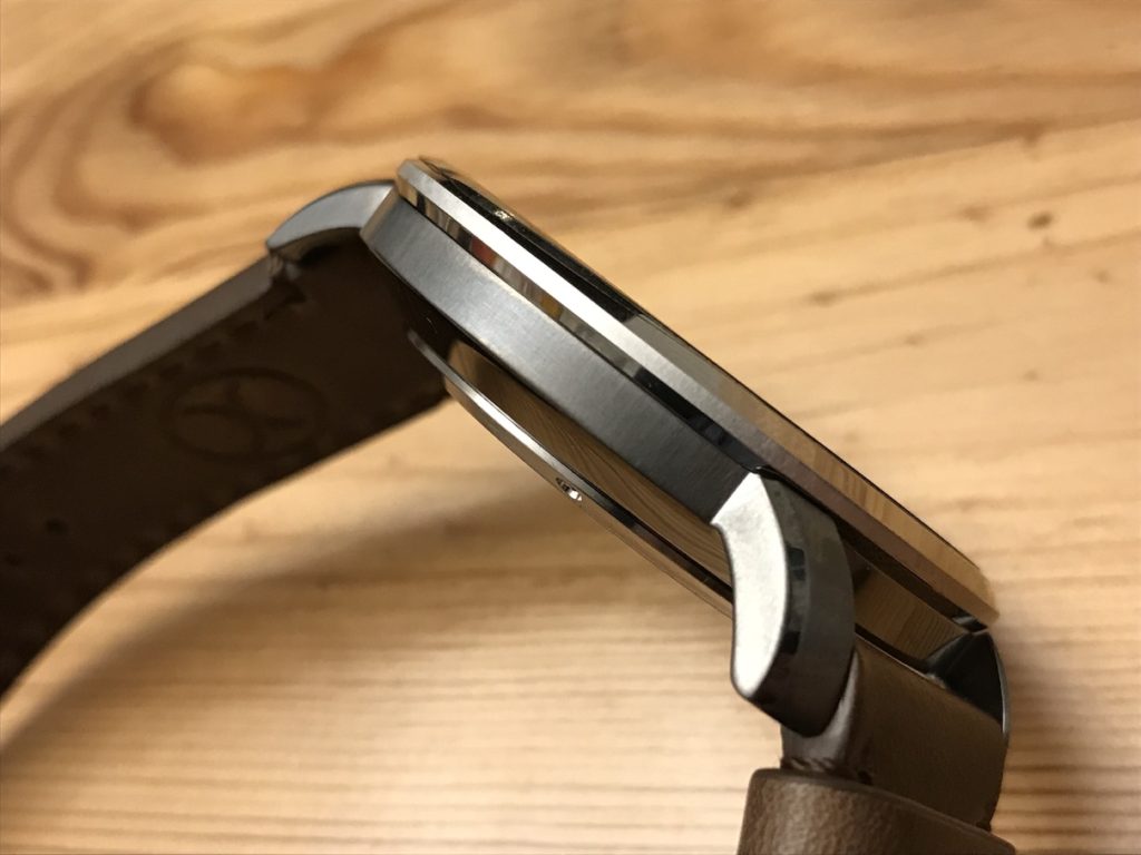
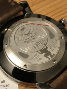
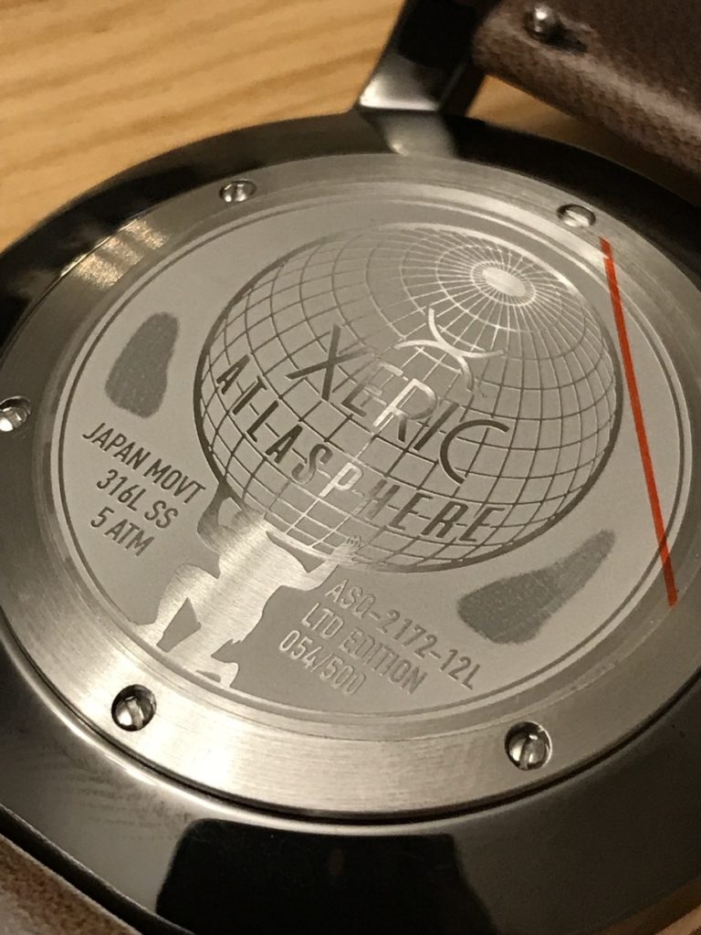
- Case: Polished steel and gunmetal combo, heavily curved lugs, case back design
- Crystal: Sapphire
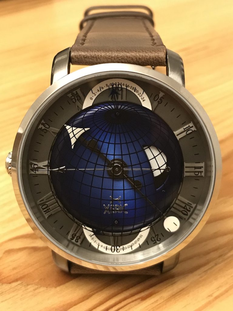
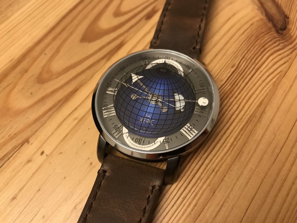
- Colors: Blue, grey, and white provide a nice look; The raised blue sphere and 3D look are very well done
- Dial: 24-hour/Full-day cutout with the Sun is clever and well-executed
- Reading the time: Big hands and the revealing minute track
- Retrogrades: a fun complication to have in a watch and they look cool at the poles
Cons:
- Case: Upon opening, one case screw was out and rolling around in the box
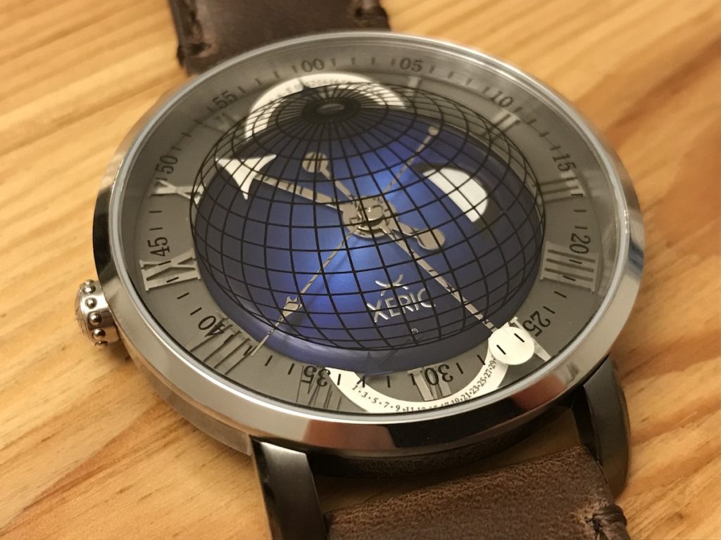
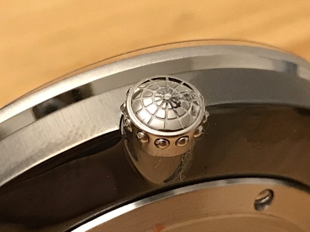
- Crown: Etched surface attracts dirt and material, which mine shipped with; why the beads and left side placement (makes setting awkward)?
- Crystal: No anti-reflective coating, which would make a BIG difference on this particular watch
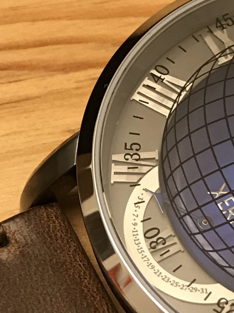
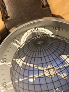
- Dial: Mine came with an imperfection (see pictures below)
- Printing: The latitude/longitude lines are distracting, I know it adds to the 3D effect, but it might have been better if printed on the surface of the sphere
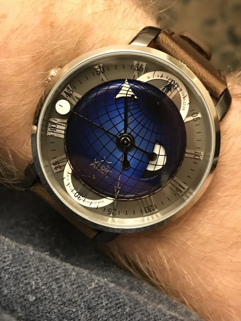
- Reading the time: It is nice that the hands are big, but as with many Xeric watches, you cannot quickly read the time due to light, printing, and design. Overlap points of the hour and minute can make reading the retrogrades (GMT and Date) difficult on a regular basis.
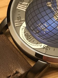
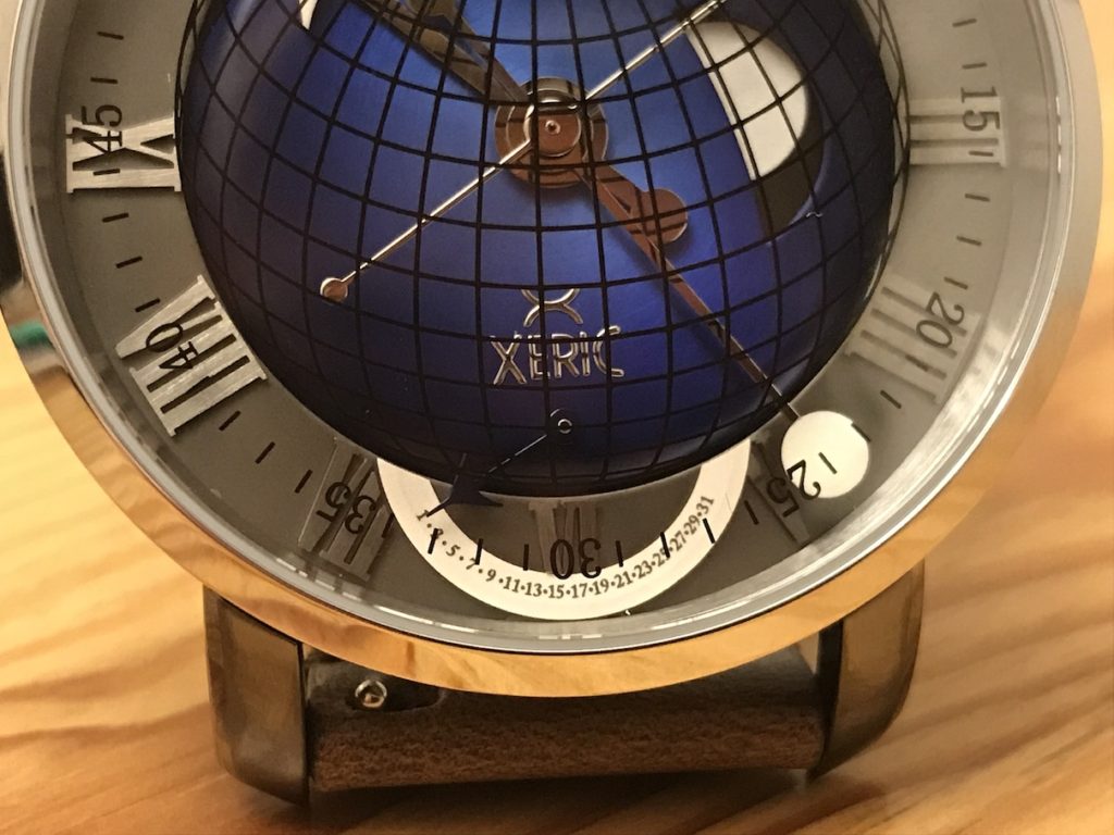
- Retrogrades: They are unreadable. The printing is microscopic (not an exaggeration). With so much real estate in 46-47mm, why they went so tiny with the GMT and Date retrograde printing is baffling. Also, the retrograde hands can be hard to see, due to color.
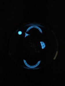
- Lume: Does not last very long, only 15 minutes or so on a reasonable charge
Standard box, nothing fancy.
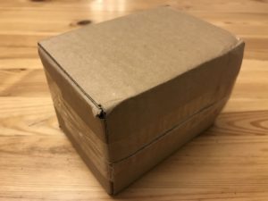

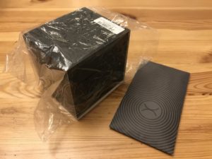
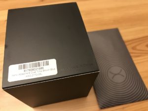
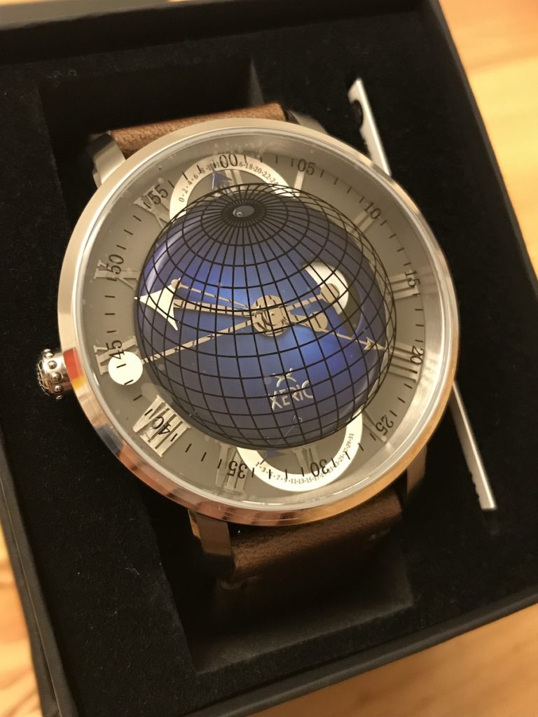
When I opened the box to take the watch out, a case back screw fell on the table. Not a good show for quality right out of the gate.
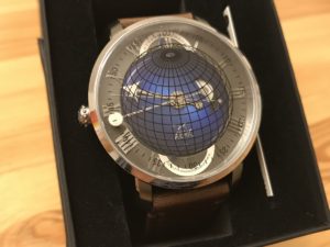
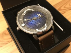
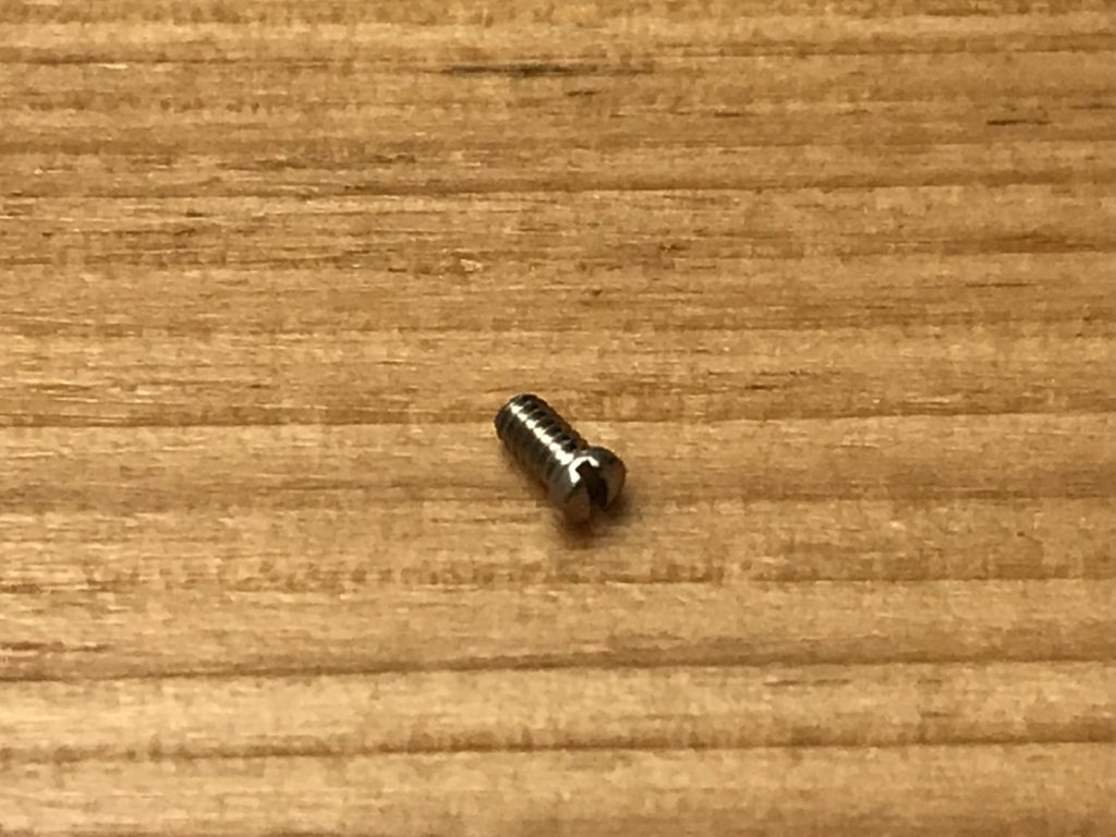
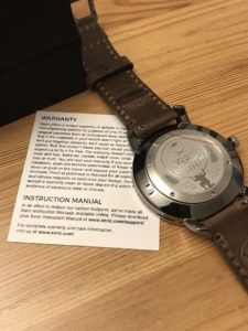
Warranty card and how to get the manual. Again, you can see the case back screw missing on the right side below the crown.
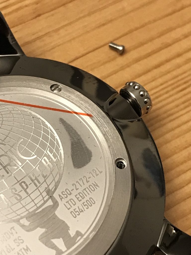
The latitude and longitude lines are etched into the crown, which gives a fun effect, but as you can see, it attracts dirt and such. I think this was some black material from the packaging, but regardless, not a good sign. It would have been better with a lighter etching or else embossed (raised).
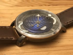
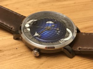
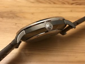
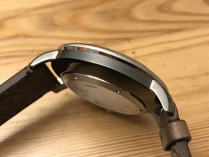
I should mention that I do like the gunmetal color, though it does pick up prints and smears very easily.
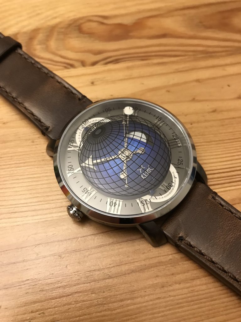
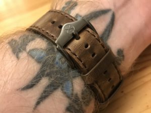
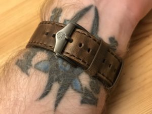
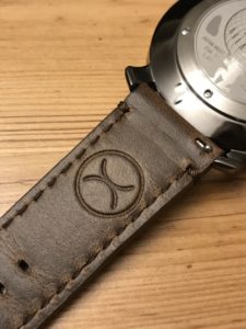
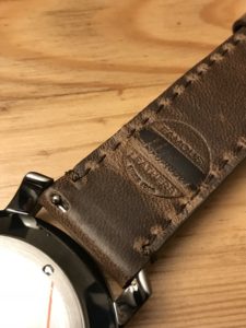
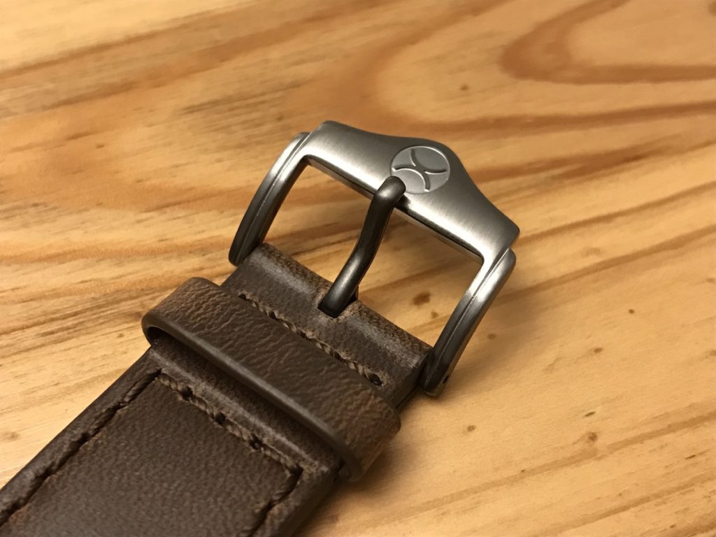
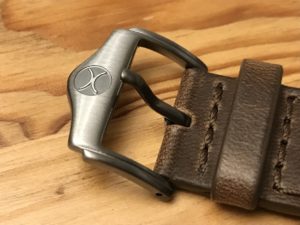
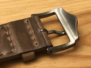
The Horween leather strap is nice. Although the watch is large, the strap adds some comfort and helps give the watch a lighter feel. Quick release pins are always convenient. I also find the buckle unique and attractive
Note the dial imperfection between 7 and 8 o’clock.
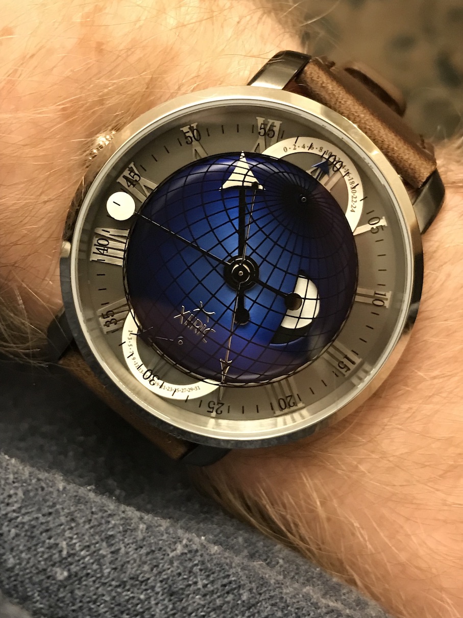
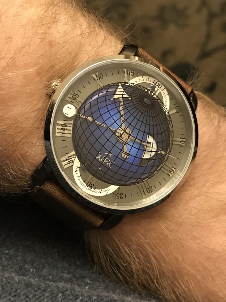
The retrogrades are a cool feature, but the print is extremely tiny and basically unreadable. That renders the GMT and Date somewhat pointless other than their contribution to the overall design. The hands can also be quite hard to see.
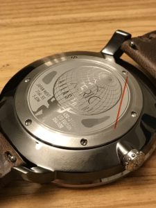
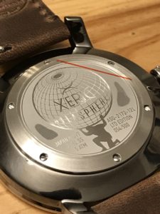
The case back is a good design.
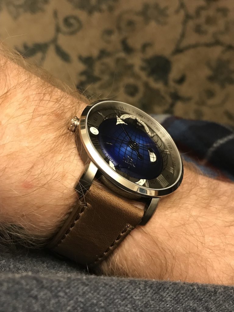
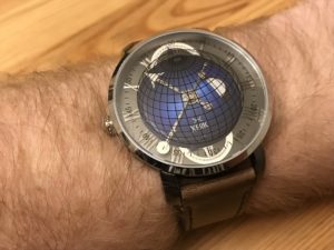
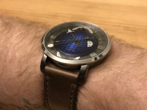
On the wrist…
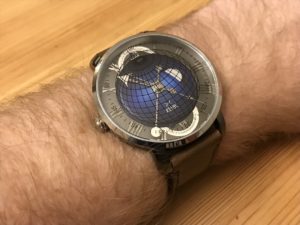
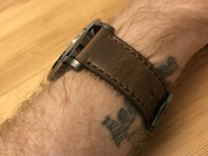
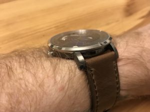
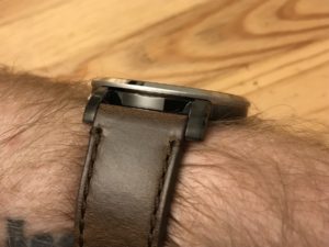
The full-day window is clever and well-executed, but I do find the printed globe distracting and it may have been better if printed directly on the blue sphere instead of on the inside of the crystal. The sphere is raised and the blue tones are excellent.
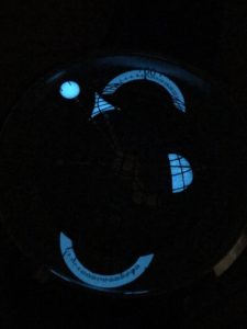
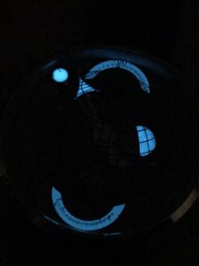
The lume is low-grade, and on a reasonable charge do not expect much more than 15 minutes. It fades fairly quick and again, the retrogrades are not readable in the dark. I should mention that this exact model, the Blue GMT, is the only model with the lumed retrogrades and full-day (sun), which does give a neat effect overall.
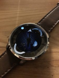
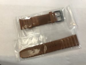
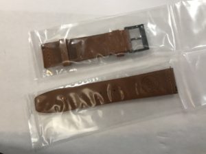
I did get an extra “Trappist” strap to have another option, though I think I like the dark brown strap better. The packaging for a Xeric strap is simple: plastic wrapped and placed in an envelope.
Final Thought
The Atlasphere GMT is an interesting and fun earth/space-themed watch. From a distance and for general wearing the design is eye-catching and it tells the time. It is even likely to be a conversation piece. But when it comes to the details and quality, it falls short. I doubt it will remain in my collection.
