Watchee App
Time for something different and especially in my wheelhouse. Presenting Watchee, an application for managing your watches! Keeping track of a collection digitally has many factors to consider so this post covers a lot of ground. This review includes a watch app comparison, Watchee pros and cons, and a visual walkthrough of using the app. A follow-up post will introduce a web-based interface I created for a desktop experience with Watchee data. If you are looking for a watch collection application, Watchee is seriously worth considering.
The developer of Watchee has given me 10 codes for a free app download (reg. $4.99) on the AppStore. Want one? Here’s how to get one: Enter your name and email to comment on the post and state what your current method is for managing your watch collection information (if none then say so). Feel free to add any thoughts about the review and app. The email address is just so I can contact you with the download code. You are not required to subscribe to my blog or YouTube channel as that is your choice. But if you like my content, why not?
I recommend fixing a cup of tea and settling in for a long one.
The reason I say this topic is especially in my wheelhouse is rooted in the profile blurb near the bottom of every blog post…”I am a watch maker and blogger that likes to share my thoughts and projects. As for credentials, I have a doctorate in computing, not horology.” My day job is that of a computer science professor, software engineering more specifically, which means I am a programmer that educates programmers who hopefully become creative problem solvers. Ah, students…
So yup, my wheelhouse. I get the process behind developing an app. I can tease out the whys and wherefores. Reviewing software design for a watch app is both professionally and personally entertaining for me. I was considering writing my own app to help manage my watch world, but that would mean another iron in the fire and a full blown app was not something I wanted to take on right now, so I went looking and found Watchee. Still, I did build something you will see in the next post.
Other Watch Apps
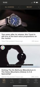
For a brief moment I want to discuss why not other apps for a full review and recommendation. What other options exist? Well, not many. Some of you are probably managing your collection with a spreadsheet, like I have. A few really rough apps exist that I forego mentioning, but here are the specimens you will likely come across if you go searching for watch apps: WatchBox, Chrono24 and news apps like Watchville.
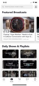
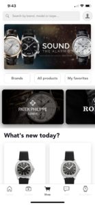
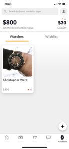
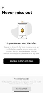
WatchBox is the closest to Watchee in terms of watch collection features available. However, WatchBox is part of a much larger ecosystem, it helps to have an account, lacks watch specificity, and has significant bugginess.
WatchBox main screens for Home, Studio, Shop, and Sell
WatchBox screens after new install and starting a collection
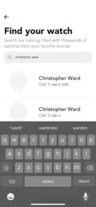
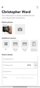
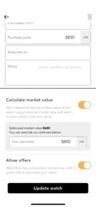
WatchBox screens for adding a watch
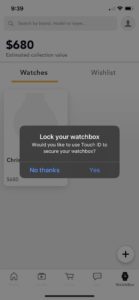
WatchBox prompts you will encounter
WatchBox watch specification screens
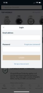
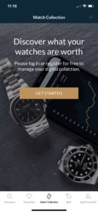
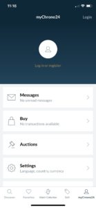
Chrono24 also has a collection feature, but requires an account to do anything. Some people won’t mind tying their personal information to another entity, but some will.
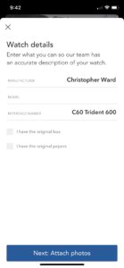
Chrono24 main screens when using app (without account)
Along with popular apps like Watchville, these interfaces are primarily built for disseminating watch news and information, not managing your personal collection in detail. Also worth noting, look at the screenshots very carefully. WatchBox and Chrono24 are primarily and clearly intended for luxury watch collectors (and flippers). Watchee provides a more general and unassuming interface unencumbered by accounts, news, ads, and bias. Watchee, as an independent framework, has the primary purpose of helping you manage your collection and is simply intended for any watch collector.
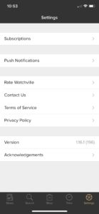
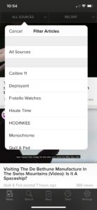
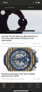
Watchville screens (a watch news app)
Returning to the developer point…when you buy an app you are, in a sense, also buying the developer(s). After reading a few Watchee reviews on the AppStore, I could sense this was worth a chance due to the update activity and responsiveness and conversation between developer and community. (Read the reviews for WatchBox on both Apple and Android stores.) My sense proved correct and in the time since first downloading the app, Anssi and I have communicated on almost a daily basis, exchange app ideas/improvements, and share watch preferences. Not everyone is going to interact with a developer in that way, we do because of our professional connection, but the point is that he is a great guy and it shows in his product development. Well worth the $4.99 price tag.
A note on Watch Databases
In reading a slew of app reviews you will find that people often expect these apps to have a database from which people can select their watch with the specs included and proceed to complain if the database doesn’t have everything. WatchBox has something of a database, mostly luxury specific, whereas Watchee does not. Even if you find your watch in the WatchBox database, the information is likely to be incomplete.
Personally, I am ok with not having a database and prefer entering the details myself so I know the details are correct. Not everyone will like the process of data entry, but there is a solution to help. Do not enter all your watches at once…unless you really want to. After downloading Watchee, just add watches to the app if you wear one you have not entered yet so you can mark “Wear Today.” Eventually, all your watches will be in the app. Entering one watch here and there is not onerous.
If you want a database with every possible watch in it then I recommend you put one together and create an API for developers. You may make a fortune. Actually, that is not a bad idea, but it would 1) take way too much time, 2) keeping it updated would be a gargantuan task, 3) there are just too many brands and too many models for it to ever be satisfactory or complete. The watch database world is your oyster…heh.
Watchee
The review: I will highlight and discuss specifics in more detail as I present screenshots.
Pros:
- Focus on collection management
- Very detailed watch specs and options
- Exports most pertinent watch data to CSV (comma separated value) file
- PDF export options for individual watches
- Watch Status and Buy/Sell info
- Concise and useful summary data
- Wear, Keep/Sell, and age ratings
- Built-in accuracy timer
- Fairly straightforward interface
- Minimal bugs (not come across anything major yet and no crashes)
- Draw/Shuffle for when you can’t decide what to wear!
- Respectable price of $4.99
Cons:
- iOS only, sorry Android peeps
- Some interface/design quirks (what app doesn’t have some?)
- Some ambiguous and unclear steps/sections (in Accuracy and Warranty)
- No database is inconvenient, but understandable and tolerable
- Risk of indie developer choosing to end development (not the case currently)
https://youtu.be/pqG-bVhdIc0
As you look at the following screenshots, note I am on an iPhone 11 Pro, in dark mode (not quite optimized yet and some screens look better in light mode), with Watchee version 1.7.1 and 1.7.2 to show update examples. No, I do not have all of my watches entered into the app yet.
Key Features
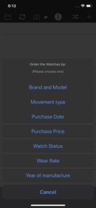
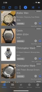
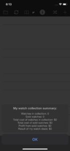
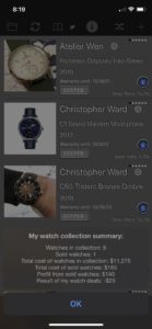
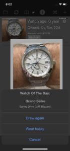
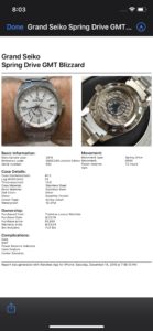
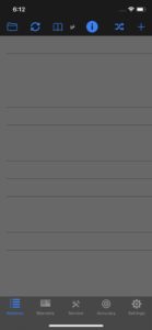
Key features include the following: a variety of ways to sort watches (folder icon in header), flip between front and back pictures (circular arrows in header), collection summary (book icon in header), draw random watch to wear (crossed arrows in header), PDF output for printing and for sale ads (tap on a watch and scroll down to Documents section), and the accuracy timer (target icon in footer).
Adding a Watch
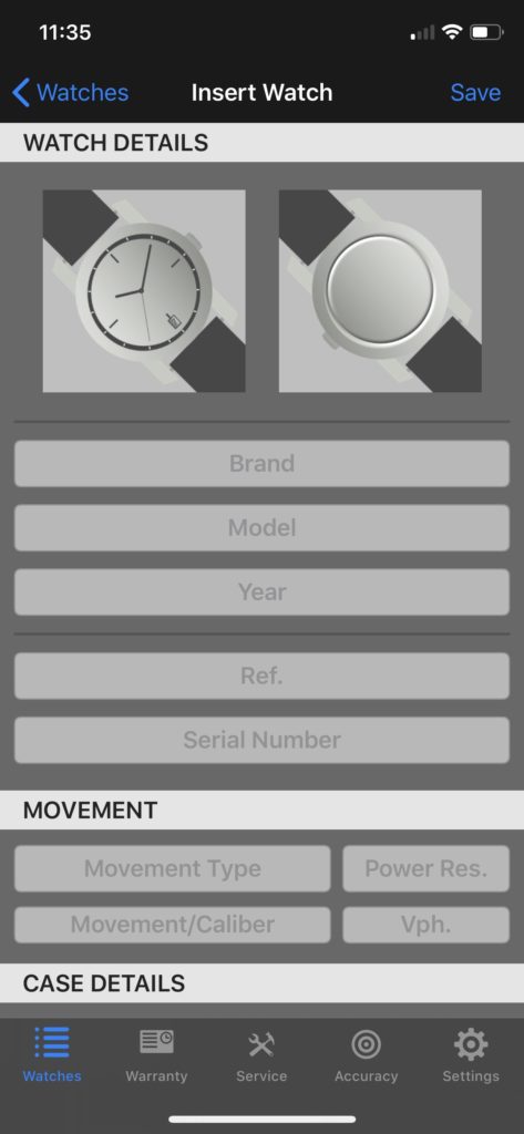
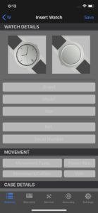
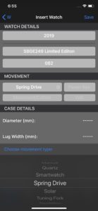
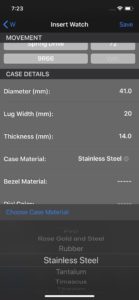
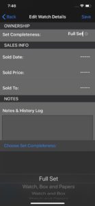
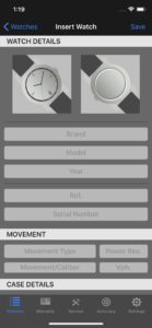
Adding a watch is fairly straightforward. Tap the + icon in the top right of the header and enter the details. Having the selection lists for some of the specs, like case material, does help with the speed of data entry. The “W” back arrow in the top left has been changed to “Watches” in v1.7.2. What I really like about Watchee is the level of detail that can be entered if desired (not required).


Watch Details (after adding)
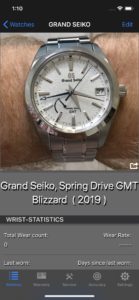
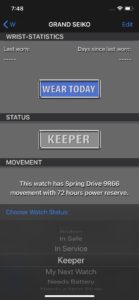
When you tap on a watch and go into its details, you can select “Wear Today” and the app keeps track of your wear stats. If you want to know how much you are wearing each watch in your collection through a year, perhaps to help you to decide what to keep and what to sell, then you will love that feature. If you tap on the picture it will flip between front and back. The share icon in the lower right of the picture (moved to the header in v1.7.2) allows you to share the watch details in a variety of ways.


Info Screens
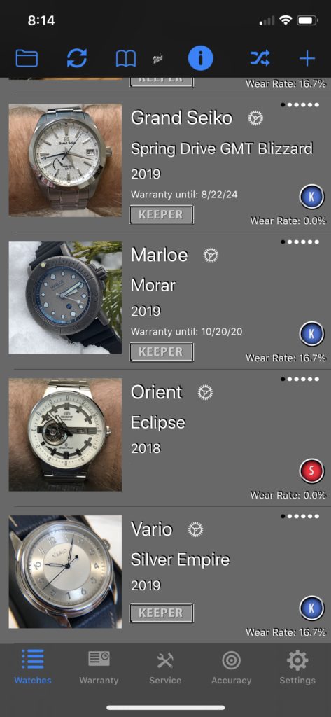
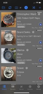
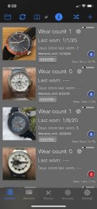
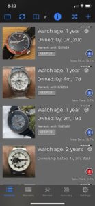
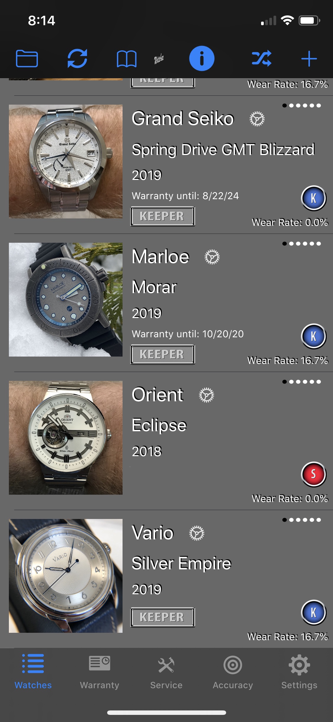
The first screenshot in this section is v1.7.3, which has changed the Logo icon at center (still squished but will get fixed) and more importantly moves the Gear icon for each watch from next to the title line to the status line at the end of each watch (on my suggestion). The cleaner layout looks good as you can see compared to the other screens from v1.7.2. Again, the app developer responds well to feedback and is consistent with thoughtful updates. If you tap that gear, you get a popup that has the “Watch Technical Info.” When on the Watches screen, if you tap the Information icon (I), the display info cycles through Main info (name, brand, year), Wear stats, Movement specs, Buy/Sell info, and Ownership details. The row of small dots in the top right of each watch denotes when screen you are viewing. The dots do not need to be repeated for each watch in my opinion, unless you could have watches displaying different info sections.




Keeper and Seller Rates
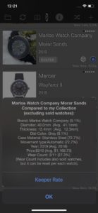
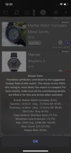
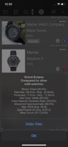
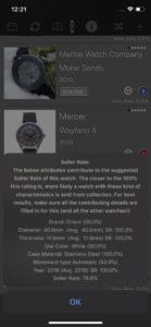
An interesting and fun feature is the Keeper and Seller rates. For each watch, you see a small “K” or “S” badge above the Wear Rate. A watch is considered in the Keeper category if it is still in the collection, while sold watches comprise the Sold category. If you tap on the badge for a watch, what you see is an average of some of the watch specs across your collection to tell you how much of a “Keeper” or “Seller” that specific watch is relative to your collection (as averages).
Settings
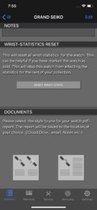
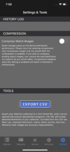
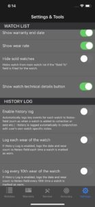
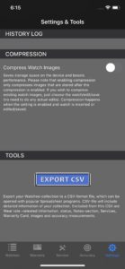
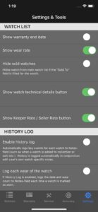
In the Settings (gear icon in footer), you can turn some viewing options on and off like the Warranty info I mentioned, Wear rate, Technical details, etc. Settings also exist for compressing images, what to note automatically if anything in the history log, and export to CSV…if you still like having your watch collection data in spreadsheet form on your computer. The second two screenshots in this section show how the section titles look in iOS light mode as opposed to dark mode.
Accuracy Timer
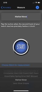
Watchee has a built in Accuracy Timer, which is nice if you don’t want to have a separate app for testing the accuracy of your mechanical watches. Some examples of standalone mechanical watch trackers are Watch Tracker ($4.99, good reviews), Movement – Watch Tracker ($4.99, good reviews), and Toolwatch (free, mixed reviews).
Accuracy tests in Watchee will be fairly good, but like all of these apps the timing has a lot to do with the user doing it right. I demonstrate using the accuracy feature in the review video. Results may not be exact, but they will give a nice ballpark, good enough for most people. The longer you let the test run, the better and more accurate it will be. 24-hours plus is really preferred, but 12-hours is the app recommendation for a minimum. Other nice features Watchee offers are the ability to run multiple tests simultaneously, even on the same watch, and to do interval checks without finishing and saving.


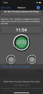


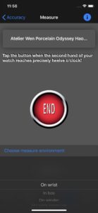
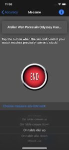

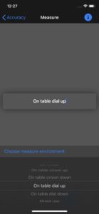
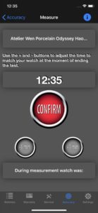
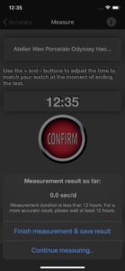
Some needed changes that I hear are coming are that the drop shadow in the accuracy area is different than on main page and looks a little blurry to me. Also, if the watch is slow you get “-secs/day” while if your watch is gaining you see “secs/day.” Adding the plus sign so it is “+secs/day” would provide clarity and consistency. I’m sure that will happen in a future update.
Warranty and Service Management
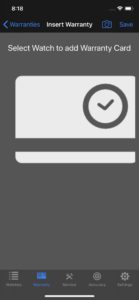
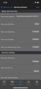
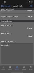
The Warranty and Service features (icons in main page footer) provide some basic functionality. Both are straightforward in terms of use. A warranty has you select a photo of an actual warranty card that may have arrived with the watch. Whether or not a watch comes with such a card depends on the brand, but many do. Service is basically a list of what has been serviced, when, why, and at what cost. To delete anything in the app be it a watch, accuracy test, or service trip, just do the traditional swipe left on the item and you get the delete button.



A hint at v1.7.3
The following is a screenshot of v.1.7.3. I wanted to show this to emphasize the point that the developer works on incremental User Interface (UI) updates and interesting/fun features. Two examples in the pic are the bolts on the watch nameplate and the “Cost per wear” that splits the cost of the watch every time you wear it. 🙂
Final Thought
Well, this post is quite long but hopefully all the screenshots help express the features of Watchee in a meaningful way. Being a watch enthusiast and a programmer is an interesting interconnect. I am happy to have found Watchee for both managing my watches and providing me an opportunity to put my programmer hat on as well. Getting to actually know the developer and establish a friendship with Anssi has been an unexpected side effect, but a pleasant one.
I highly recommend Watchee for any type of watch collector and in my opinion Watchee is the best watch collection app in the App Store.

















Thank you for this review! I’ve been considering Watchee and now I definitely want to try it out. Currently I use Trello to keep track of what watches I own and which ones I’m considering. I like the idea especially of knowing how often I wear particular watches. Thanks!
Hi Andy,
I’m the developer of the Watchee app and really glad to hear you want to try it out. Any comments or enhancement ideas, please just leave a note and it will definitely be considered for future updates.
Cheers,
Anssi
Hi Brian, great review and definitely an app worth having. Thanks for the review.
Forgot to say, looks much more useful than my current spreadsheet on the iPad!
Hi Steve,
Glad to hear you liked Brian’s review of the app (I’m the developer of it). If you decide to try it out, I sincerely hope you will like it.
Cheers,
Anssi
Thank you Brian for a thorough review of the app. As a developer of the app and en eager watch enthusiast myself, I’m always looking for ways to improve the app and often it happens with suggestions from fellow watch enthusiasts. The pointers you’ve found out and noted me about have already helped to improve the app a lot. Also for the upcoming v1.7.3 there will be many enhancements thanks to you. Keep up the good work and always happy to watch your reviews!
Very thorough and useful review (drank coffee not tea 😉 ). I particularly like the idea of wrist time stats. I currently have a very basic excel sheet and the thought of a dedicated iphone app definiely brings appeal and usability!
Great review, enjoyable read with a coffee. Congrats
How you currently manage your watch data? If at all?
Oops, forgot to say. I use OnMyWrist app to track which watches I wear and a basic spreadsheet in Numbers app to track watches bought/sold/date/prices paid etc
Really interesting review. I currently save my information in a very basic spreadsheet that I store in a cloud account.
It’s accessible remotely by mobile but it’s not the most user-friendly application and I regularly forget to update it!
This looks like it would be much more usable and useful 🙂
Great review, Brian. I can see some features of the Watchee app that could be quite useful (like tracking wear statistics). I have a Chrono24 account, but haven’t been keeping it up to date. It’s not the most friendly app for minding the collection…
Great review. Definitely will consider this. Presently just using a spreadsheet.
Currently I lack a watch inventory system of any kind and having seen the review of this system over at Christopher Ward Forum I’m certainly about to reach for my android and the playstore. I take watch photos on my phone, what better way to inventorise them? Count me in please!
Hello, the first comment by a contributor has to be approved first, I might change that though. So it is now visible.
Great review. I currently use Toolwatch – the interface looks nice but it’s very limited and hasn’t been updated in a long time
I currently have no coherent system. Hit and miss. Not too savvy,
need help!
Thanks
what?